Tuesday, 16 February 2016
How has the target audience research effected ideas?
From researching into my target audience through a 'Survey Monkey' survey, I have evaluated what I have gathered from doing so and what the audience expect. I have selected a song based upon the exception of the audience wanting something rap/hip hop in style which I have taken on board and have selected a rap instrumental song as a result which also fits the pace of the clips I desire. I have also taken influence from the audience enjoying narrative based videos which are interesting to watch due to the audience being able to follow the story of the song.
Video Budget
Thinking about video budget is important to directors and producers of a music video/ film makers so that they can distribute money evenly to actors, equipment and location. This so actors are payed a fair amount for the work they do and for food etc so they are looked after, camera equipment, bike equipment etc which is needed to help produce what is wanted in the shots and also might have to pay the owners of property or land for permission to be filmed and acted on and for that location to be allowed in the video once released to the world.
Lucky enough for me, the only other actor I need for the video is one of my best friends Tom who I ride with weekly despite the production of this video. Tom and I both like riding together so filming at the same time makes the sessions funner for us so he doesn't want to be payed. Out of respect I will bring drinks and food to keep up ticking over throughout the day. The equipment I already own is adequate for the job. I have a semi professional DSLR camera which videos so I can get the shots I desire through that, and the camera handle and tripod I own also helps stabilise shots so I do not need to go out and buy anything else. Finally the places we are filming does not disturb any residents of the area or get anyone else in shot so I will not need to ask permission film and ride on property.
It was important I state this as it shows me think in context to a professional filming session and the ways the producers would have to go in industry. I can also reflect on this in my evaluation on decisions I have made and will make if variables come into play.
Filming Dates Planned
Before I start filming I am planning out the dates In which I would like to aim to gather all my shots together. This is so I can follow the date list as a guild and goal.
Day 1: January 2nd 2016- 9:45 till 4 Would be good to get all of the whole sequence done on this day throughout the change in the sun creating the effect I would like.
Day 2: January 23rd 2016- 2:00 till 5:00 Would like to get more in-between creative looking shots which add feeling. Do more on the riding sequence once at the riding spot.
Day 3: February 13th 2016- 4:00 till 5:30 Focus on getting the ending sequence when the sun is setting and we ride along into the colours of the sun. Multiple tries needed to get the correct camera effect.
Final Digipak and Magazine Advert


Overall I feel like I have created my digipak and advertisement piece to the best of my ability. To create my digipak I focused throughout on the music itself and the themes I want to present throughout my video and then made certain decisions upon this. An example of this would be my colour selection of the images and the graphics I have created, my video needing to present the gritty raw feeling of riding and the struggles which I try to refer to through subliminal things like the tone the images and graphic make. The music I have selected works well as its tone and rhythm matches the feel to the video I have planned so I then had to make sure the titles typography fits these ideas within the music. I then had to transfer all of this process into the creation of my final advert which follows everything I have reflected and created on. I finally have got some feedback from my teacher and also my main rider Tom again. My teacher has stated how he likes the way I have tied everything in with purpose making my designs meaningful and my rider Tom enjoys the images creating the feeling we both experience whilst on our bikes.
Draft 5 Advert and Digipak
Now I had made my cover and digipak I had to finally create my advertisement piece for a magazine. I chose to stick with my concept of putting my digipak cover in the centre of the advert with white borders and black backgrounds as the colours all fit together nicely.


I firstly added the white titles I had developed and placed the CD cover in the centre by itself as I didn't need a repeat in titles. I additionally create the text 'debate album out now' in the same style as the first lot of text which works well as an overall cover.

Once this was done I reflected on improvements I could make to piece. A lot of the adverts I analysed were simple and linked to the genre of the music and the artist themselves which I think I had achieved, so I spoke to my teacher and my rider Tom for some feedback both agreeing it all worked well. I also learnt that many adverts have external references from popular medias so I thought this final detail would make the piece of a higher quality as if it was an industry stand piece. I didn't use the same titled text for this as I wanted some diversity in the advert. Also 'NME and MTV' wouldn't use the font I had created for their own company so I finalised on using the font 'Avenir' which is a rounded yet tall looking font which looked good with my created text due to the thicknesses of the text being medium. This then composed everything together resulting in me having a digipak cover, digipak and advert all in a similar yet effective style.
Draft 4 Advert and Digipak
I further developed my graphic into a final cover which looks like so...


I really like the way this has come out. I eliminated the surrounding bored which was bland and unnecessary and started separated text from background to stand free by themeselfs. My final mandala graphic fits nicely in conjunction to the text and doesn't take away from the background image.
Now that I had created my final cover, I needed to develop my digipak. I placed my final cover on the front of the template I had as a base to the piece and started to eliminate a large collection of photographs and screen shots I had in a folder which I was contemplating putting on my digipak. I finally decided on some which fit nicely together and were visually interesting presenting elements of my video. I turned them to black and grey and adjusted there colour, light and shadow balances to make the come out as dynamic as possible.
Digipak 1 with the placement of the photographs

Digipak 2 with added in spines in the colour range of my theme. Added in my graphic onto the format of a CD.

Digipak 3 is further developed to have a realist CD with my made graphic and adding a track list and barcode to the back for a professional look.

Draft 3 Advert and Digipak
After getting an image I was happy with for my cover I wanted to continue to develop this to a higher level as I want to achieve high marks overall in this section of the work and get this to industry standards due to my interest in pursuing graphic design as a career.
Moving on with the development of my digipak I wanted to focus on the front cover first, as this is the initial thing the audience will see and what is like the sales pieces of the whole video/music whilst in advertisement and on the shelfs in shops. I started to think about the feeling the song I gave chosen and what sort of typography and fonts I could use to suit this theme the best. I also thought about developing a graphic which links in nicely.
I started off looking at san serif type faces this being text without 'flicks' as the natural curved fonts would link to the overall flow of the video and also the urban tempo of the track itself. I wanted to put this text in a contrasting colour to the darkness of the image so white initially came to mind in making the text pop as opposed to blending with the background.
I searched through the pre set fonts Photoshop and Illustrator have to offer, not really liking the forms of the text so I started to look elsewhere on sites like 'dafont' and 'Fontspace'. I found a copyright free font with large curved letterings so I took this onto Illustrator to change slightly. I added more connectors between the letters of the name of the song and also the artists names themselves which I like a lot better due to the flow of the text.

Here is the colour change I made and the manipulation of the text. I think this looks nice and works well, the text is fairly simple yet has the accents for a slightly digital effect which suits the tone of the track.
I then started to compose this onto the digipak cover. The final thing I needed was a main graphic. I wanted this graphic to be some sort of geometric shape to match the feel of the titles but also to have the graphic to tie the composition of the pieces together. I know my types of patterns and shape as I practice graphic design in my spare time (as I already stated) so using something aztec of a style of basic mandala could work due to the symbolic meaning of them and also the slight urban effect they have which would fit well. I experimented with a range of shapes in conjunction with each other and created a circular graphic as a result in the white colour matching the titles. Overall I really like the result of the graphic because the circle being subliminal in presenting a bike wheel or the cycle of a day in the life of a rider links well, and the complexities within the graphic representing the obstacles the rider faces whether it be riding far to have fun or the effort of building to create and achieve something to be proud of or enjoyable.
Initial graphic I produced didn't work well, the lines were too complex and thinned out not being visually easy to view.


My second graphic developed from a lined shape to a thick white mandala where I experimented with composition and the play with my text.


Final graphic

Progression and development


Monday, 15 February 2016
Song Choice
After researching into all different genres of music and styles of music video and also gathering feedback from an audience gathering a specific target I want the video to be aimed at, I have decide to use a rap/ hip hop style track. This is because of this genre appealing to the audience the most and the diversity of the genre itself ranging from a intense meaningful song to a paced beat. I like this as I want the track to link to the meaning of bike riding, and including a track which links to the efforts grittiness of the sport should work well.
I started looking on websites like 'Soundcloud', 'Youtube' and apps like 'Spotify' to find a track which I like that would fit nicely. The track also had to be copyright free or a track I could buy and use without avoiding the terms and conditions of stealing music so I looked and niche artists. A lot of the BMX edit songs/ backing tracks are from 'Soundcloud' so I used this website to look further into typical types editors would choose.
I eventually came across a song on Youtube from the channel 'Husk music' with a song called 'Ones' by the artists 'Mr Carmack and Kaytranada'. Its an instrumental style track with a hard hitting pulsating beat and a constant high hat symbol rhythm with a digital piano style melody. This stood out by far, due to the beat and symbols almost presenting that constant drive a rider would have (which I know from experience) and the melody being chilled presenting flow and enjoyment. The track is the duration of 3:46 seconds being a nice time to present what I would like to for my video, being the fact that its a narrative and I want to present the progression of a day out riding.
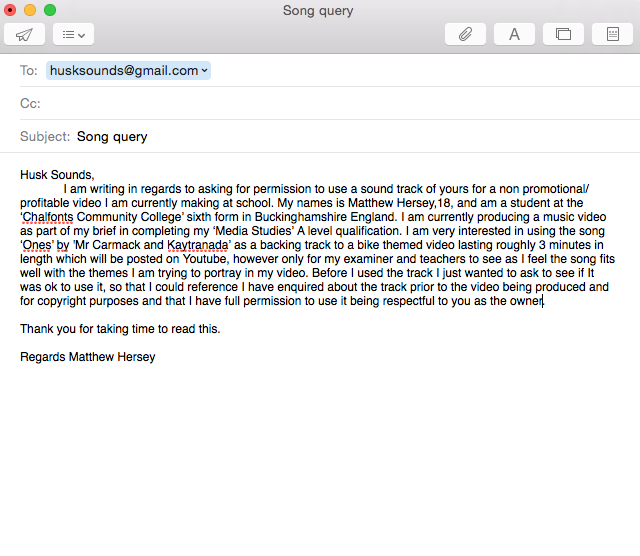
I have also emailed the owner of the song asking for permission to use this track for my video.

I started looking on websites like 'Soundcloud', 'Youtube' and apps like 'Spotify' to find a track which I like that would fit nicely. The track also had to be copyright free or a track I could buy and use without avoiding the terms and conditions of stealing music so I looked and niche artists. A lot of the BMX edit songs/ backing tracks are from 'Soundcloud' so I used this website to look further into typical types editors would choose.
I eventually came across a song on Youtube from the channel 'Husk music' with a song called 'Ones' by the artists 'Mr Carmack and Kaytranada'. Its an instrumental style track with a hard hitting pulsating beat and a constant high hat symbol rhythm with a digital piano style melody. This stood out by far, due to the beat and symbols almost presenting that constant drive a rider would have (which I know from experience) and the melody being chilled presenting flow and enjoyment. The track is the duration of 3:46 seconds being a nice time to present what I would like to for my video, being the fact that its a narrative and I want to present the progression of a day out riding.
I have also emailed the owner of the song asking for permission to use this track for my video.
Wednesday, 10 February 2016
Focus Group Feedback
Now I have started to create my final pieces ( ancillary tasks) I am thinking about the themes and views I want to portray throughout. To help with this, I have asked 5 friends who have been riders for many years for some input and thoughts about what I should include as I thought asking this niche audience who would have understanding of the sport would help me with ideas to portray bike riding in the best possible way throughout my digipak and advert.
Responses:
Tom- "Make sure elements of parts of the bikes are shown to show detail of the bikes themselves, show the audience real, current bike parts to be as realistic as possible."
Kai-" Cool graphics without going into the typical graffiti font types, graffiti is too generic."
Joe- " show actual building of spots, shows depth to the sport."
The other two riders gave similar response. Using this feedback I will make sure to select photography and typography to consider these views so that the final product is understandable to non bike riders, but also relatable to bike riders themselves.
Tuesday, 9 February 2016
Draft 2 Advert and Digipak
After I had created my first advert and digipak I reflected on my thoughts of the video and came to a conclusion of the cover being to similar to the video itself due to the action being shown and the positioning being basic. I thought that if my cover didn't include bikes or riders but more an image which shows the creativeness I want to portray thought the video and a basic logo to suit this photograph.


Whilst filming the introduction of my video at Toms house, the main rider in my video, I was playing around with the settings on my camera trying to capture some lens flare as this was a creative style of shot I wanted to include later on in the video. This was a shot I didn't think much of at the time, however since looking back at the shots and photographs I collected over my filming sessions this stood out as representing the essence of the video. It includes the beauty of the natural light which I liked as it helps present and compliment the beauty of the riding itself, the starting location of the video Toms house which is important to the view of the narrative within as it shows the progression of the day and how Tom would leave his house to natural fresh feeling of the start of the day and the natural growth of the ivy which follows the overall theme.
I decided to experiment with this photograph to see how this would fit around my current ideas of the digipak front cover. I took the photograph onto 'Photoshop' and enhanced the light and dark areas within the image then turned it to black and white which links to the raw feeling I overly want to present. I then cropped the photo to the dimensions of a square cover, including the real key features of the photograph.

Enhanced photograph

Cropped/transformed photograph

I finally placed the cover in digipak form to see it in context. Although there isn't the rest of the images on the digipak I can see it in proportion to the rest of the areas and see how this would be at the front of the digipak and the placement of everything else within.

I also placed the image in a similar format to the original advert to get a perception of how I could play with this format.
Subscribe to:
Posts (Atom)